Women’s Theatre Festival
Dance outside of your comfort zone.
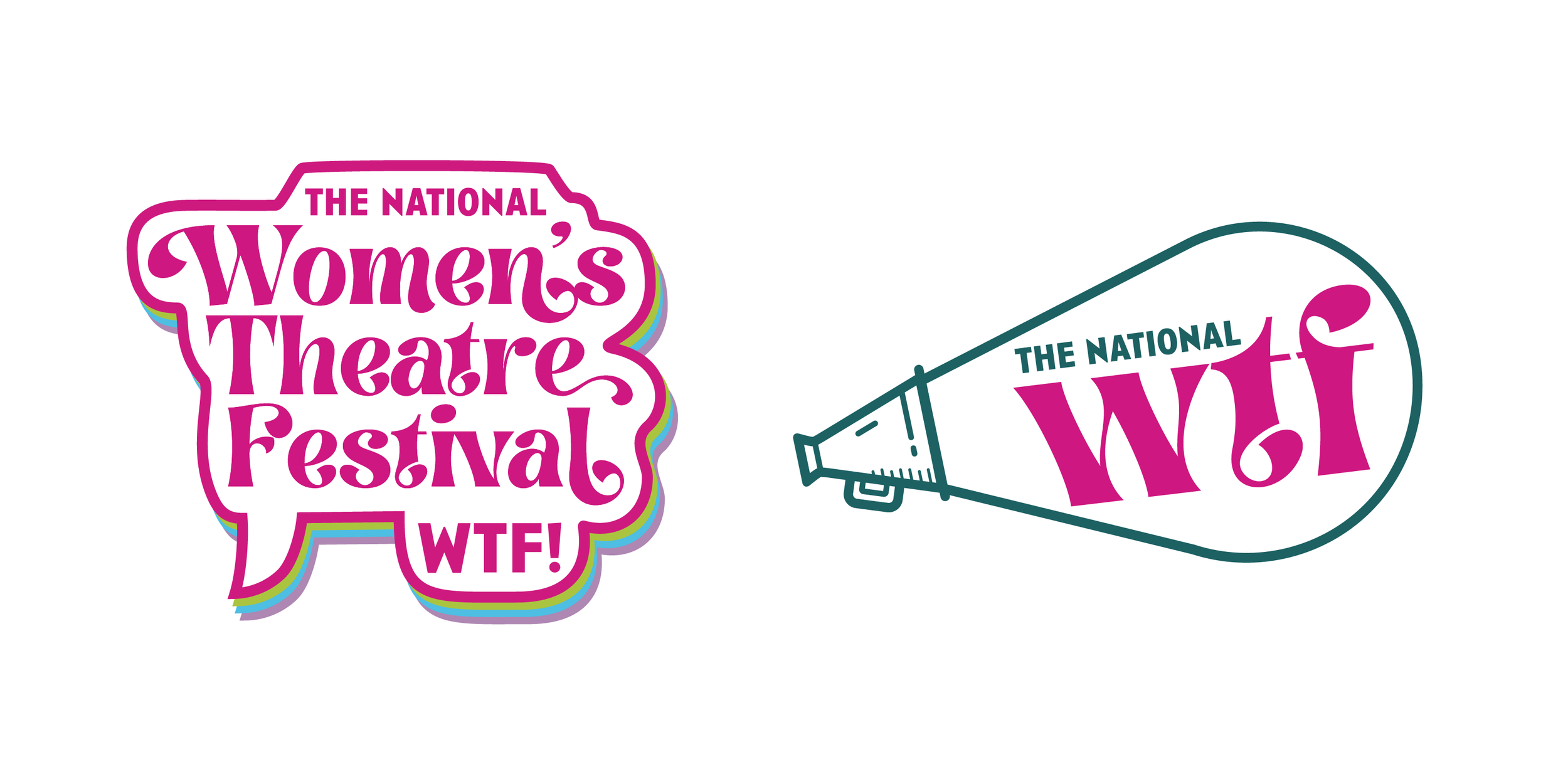
The Women’s Theatre Festival, also known as WTF, was one of our clients at Loop Creative. Funky, spunky, fresh, and in your face, the powerhouses at WTF wanted to move away from their previous branding toward something inclusive of more than just white women. They came to us with a beautiful mood board full of contradictions and told us to throw our messiest spaghetti ideas against the wall. We proceeded to scan homemade textures and paint splatters, experiment with unorthodox imagery and weird color combinations, and looked for flavorful typography - swashes and ligatures and beautiful ornamentation. The final look was calmer than some of our exploration, for sure, but overall it has communicated that WTF is inclusive, fierce, and embraces curves in every form.

Logos
Primary Logo

Secondary Logos


Merch Stickers (Alternative Logos)
Patterns


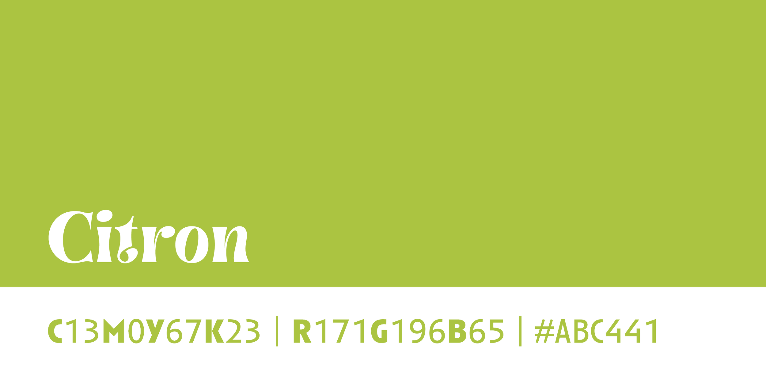
Color Palette
Primary Colors


Secondary Colors

Typography

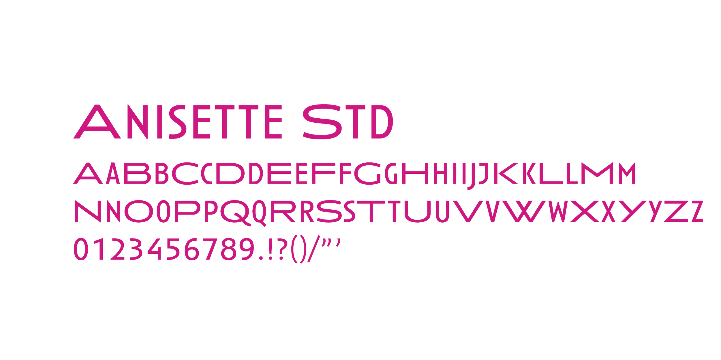
WTF’s branding uses Brasika Display and Anisette Std. They wanted to be able to design graphics for themselves in Canva, so the fonts used needed to be available there. Their website uses Swear Display Cilati, which closely mimics the curves and feel of Brasika Display, and Montserrat, which is a beautiful websafe sans serif that is easy to read.


